Risk + Reward When Buying Art
Raise your hand if you decorate with neon.
Hallmarks of a professionally designed space reveal themselves in the unexpected details—pops of shocking color in an otherwise neutral living room, loud art on top of wallpaper, a tiny painting on a large wall or an oversized painting squeezed into a smaller space, an eclectic mix of furniture styles, juxtapositions of architectural styles and decor eras, etc… When you don’t really know what you are doing, you tend to play it safe, but when you hire a professional or feel comfortable in your decision-making capability, you will often swing for the fences. I love it when clients swing for the fences because a sophisticated art collection is often one in which the collector has taken some risks.
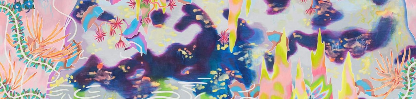
In one recent example, a client replaced a dark and tonal abstract work she had collected on her travels to Bali with a bold choice by Sarah Ann Weber. This was our first purchase together and the result was nothing short of transformational. Here are the before and after photos.


The colored pencil on paper drawing by Sarah Ann Weber practically glows against her very traditional lavender sofa. I had really always envisioned something bright coral or neon yellow in this space but did not think this first-time-art-buyer would follow me down the neon yellow brick road. Knowing what an impact such a choice would have here, I went out on a limb one day and sort of side-texted her, “Hey, what about this…” and showed her some examples of SAW’s work, which I had seen and loved many times over. To my shock and surprise and very much to my client’s credit, she immediately went nuts for it. She was planning to be in LA so I arranged for her to meet Sarah in person (thanks to the wonderful Amanda McMorran at Anat Ebgi) and see several available options. Of course they knocked her socks off in person and here we are!
Beyond the visual impact the new work has on the space, the client reports that its presence has actually transformed the way they live in their home as well. Now, she loves to sit in this room while her oldest daughter practices piano. Her two younger daughters often join her because they love looking at this work with its endless array of details to discover and discuss. Her life insurance agent even said to her, “This is not my style at all but I love this work of art!”
The family still discovers new details every day and the journey of living with this piece has helped them understand how deeply rewarding it is to visit and revisit a work of art over and over by living with it.

Bright, bold, and nontraditional colors are one way to take a risk with your art and develop a more sophisticated collection. Here are some others…
The bottom line here is that variety is the spice of life. And here are three ways to add variety to your collection that may seem risky but will ultimately yield exciting visual reward.
3-Dimensional Art or Sculpture
Just because you have a flat wall, it does not mean you have to have flat art. I love to put sculpture or three-dimensional wall-dependent art in a single space to add visual interest. Here is an example of a rendering I did for a client who is exploring her risk profile, shall we say:


I chose these three works because first and foremost they tell the story of the family who lives in this home, but secondly, because they look awesome in this beautiful, historic Cleveland home. Se Yoon’s sculpture is all about the balance and importance of giving children a solid foundation while also nurturing their ambition and confidence to achieve their goals. Hildur Jonsson is a Cleveland-based artist and this family are native-Clevelanders so it is fitting to have her represented in their collection. And finally, Stephanie’s Join is made out of mattress quilting and I love that it encapsulates the spirit of this massive dining room where the family routinely hosts dozens of people. She describes her home as wanting it to be the place where her children and their friends want to hang out, a soft place to land, so to speak! She is still deciding how daring she wants to be in this room, particularly against the very traditional decor, but we shall see…
Juxtaposition of styles or media
This one is not terribly different from the one above but I want to highlight one particular aspect, and that is that you should not put a painting on every wall. It is really important to mix in a variety of media. If you can’t get there on hanging a sculpture on a wall, think about drawings, pastels, watercolors, or prints as alternative 2-dimensional media to add to a space. I recently worked on a project in which every wall has a painting on it. The client and I felt it was really important to add variety in terms of both subject matter and media with the final acquisition. She has paintings on 4 walls, a photograph on one, a sculpture (!!) on the floor, and so we added a series of watercolors that lead up the stairs. They are being installed next week, but here is a rendering:


And this leads me to my final point:
Scale
There is a rule of thumb that the art should be 57-75% of the width of wall on which it hangs. This is really helpful when you are just starting to consider a space. But it is also really fun to throw it in the garbage and think differently! In the example above, to some degree we chunked the rule book out the window. These little water colors are small. Like 11×8” and 8×5”…on a massive double height foyer wall. We played with doing a salon-style hang and covering the wall ceiling to tread with art. We played with a large single piece hung front and center. But we ultimately settled on these small, intimate watercolors because they resonated so deeply with the client and her love of travel. By going small, we are giving each object its moment, and in a way, recreating the experience of exploring far away lands. As the viewer progresses up the stairs, they will be invited to pause and ponder and then move on. It will be a slow, contemplative experience rather than a loud, overwhelming one.
As always, thanks for being here and for reading my newsletter. I have really enjoyed this new platform and am looking forward to continuing. Have a great weekend everybody!